We do have our own mapping solution, built upon Tele Atlas digital map-data,
and our own custom route planning system, which even does turn-by-turn navigation. We
also have our own web-based geo-viewer solution. Even so, I find it more convenient to use
the free and excellent Google Earth application to do my
mapping prototyping before attempting to integrate things back into our system.
Google Earth allows you to extend their map data with custom content, such as a 3D building objects
and image overlays. Despite these simple tools to extend Google Earth, you can get some surprisingly complex
and rich information extraction, when users are allowed to browse the data in "real-time" on real
geo-data.
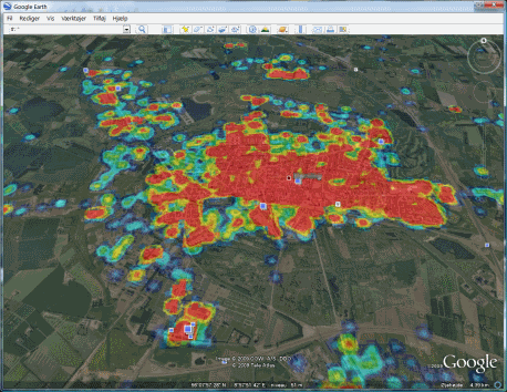
The image above shows one example of how I put the GPS data into use.
It is a heat-map of all cab fares in a mid-sized city in my country.
It is an excellent way to illustrate an otherwise confusing mass of GPS data.
A single blue dot on the image marks a single cab fare, the more red the colours get the more
cab fares were started at that location or in close proximity.
The heat-map image is integrated in Google Earth as a transparent ground overlay so it is
possible to see the heat-map and the geo-data (buildings and roads) under it.
By using Google Earth for visualization, you are able to zoom in close on the map, almost
so close that you can make out if a particular house makes more orders than his neighbour.
While you cannot tell the actual statistical data behind the colours on the heat-map image above, it is an excellent tool to get an overview of where to put your focus. Not surprisingly, the image shows a large concentration of cab fares in the city centre. The real interesting bit starts when you move out to the suburbs, where the "red blobs" become more scarce and the concentration of dots actually mean that the target company has to allocate resources to service these outskirt areas. Knowing where these areas are and when their service time peak, would obviously be a crucial business information for this company.
To visually present the data like this is called Data Exploration and is a prerequisite before the next step of doing the actual Data Mining. It involves discovering the unexpected, as well as confirming the expected - and it is also great fun.
Prism maps
 |
 |
I was trying out several different ways to visualize the GPS data.
One of the more curious ways to build graph data in Google Earth is presented by Bjørn Sandvik, who have several really cool Google Earth mash-ups available on his website. The one I particular found to be really fun, was the Prism Map.
By dividing the map into zones, it is now possible to apply a simple clustering algorithm to the GPS data. We can now summarize data on a larger geospatial level. In the images above, each of the green columns represent a zone. The height of the column represents the number of dispatched fares in that zone. While the zones may seem a little confusing, the target company would be quite familiar with this layout, since they usually operate within these areas on a daily basis.
In addition to the height being variable, a little Pie chart is floating atop of each column. The Pie chart can show the distribution between the various types of orders (load type, payment, etc). By clicking on the Pie chart, a larger version with a descriptive legend and details is shown.
For this Google Earth mash-up, I also took advantage of the fact that Google Earth knows about the concept of time. By putting a time-stamp on your custom content in Google Earth, it will display a little Time Slider knob, which allows the user to slide forward and backward in time. By providing historical data over time, the columns animate in height as time progresses.
Implementing in Google Earth
Unfortunately I cannot give you the Google Earth files for the above projects. The GPS data is not public data and is owned by the individual transportation companies.Heat map
The heat-map implementation was based on a tutorial I found on the Internet here for the C# programming language. It is a great tutorial that shows you the steps to code a heat-image. Even if I cannot share the GPS data, I have still included a simple C++ project that generates a heat-map from random data, outputs a Google Earth KML file and zips it as a KMZ file.
Integrating the heat-image into Google Earth is quite simple. Google provides good documentation for their KML files. They are simple XML files with references to additional image and 3D object data. The heat-image is placed as a ground overlay image.
One particular problem while creating the heat-map did nag me for several hours. When you are mapping GPS coordinates to a flat image, you will usually need to take the earth curvature into account. Since GPS coordinates are given in WGS longitude and latitude (or a similar reference system) that is designed to follow the earth's surface, projecting these coordinates to a flat image (when a significant distance is involved) will require you to mathematically map the geometry from a curved surface to a flat one. This took several hours of unsuccessful struggling, until I realized that Google Earth somehow manages to do this transformation itself on the image, so a regular simple interpolation algorithm can be applied when plotting the heat-image dots.
Prism map
The Prism map is created with regular brute-force 3D object construction.You can find an example from Bjørn Sandvik here. This type of chart is not all that useful for displaying statistical data. A little confusing I must admit, but really cool how the Pie charts are generated using the Google Chart API on the fly. Pie images are generated at runtime by this free Google service simply by submitting an URL to the Google servers. Very impressive.
Source Code Dependencies
Google EarthMicrosoft Visual Studio.NET 2008
Microsoft ATL Library
Installation Guide
- Install Google Earth
- Unzip the download below and double-click the Heatmap.kmz file
Download Files
 | Heatmap KMZ and Source Code (361 KiB) |